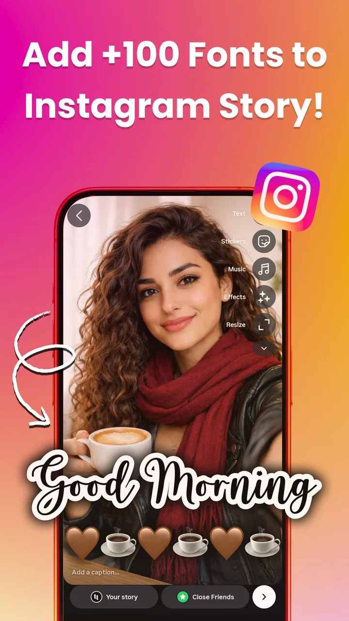
Fonts for Insta Story: Fontini
- 5.0
- Rating
- 50.00K
- Installs
- Free
- Price

 Analysis by App-foxy
I opened Fonts for Insta Story: Fontini with a simple goal: turn an ordinary Instagram Story idea into something that looked more deliberate without spending time designing from scratch. The app sits in the art and design category, but its appeal is less about making a complete composition and more about improving the text layer. That distinction matters. If your photo, video, or background is already ready, Fontini can be a useful finishing step. If you need a full design studio, it is a much narrower tool.
My first impression was that the app is aimed at people who want personality in their words. A short announcement, a birthday message, a product note, or a travel caption can feel flat when it uses the same basic lettering available in a social network. Fontini gives that text a different visual voice through decorative fonts and text effects. I found the idea practical because it focuses on a task many people repeat every day: preparing a small piece of text that needs to be copied into another app.
It is a free app from developer Saman rezazadeh, rated for Everyone, and it runs on Android devices using version 6.0 or later. The current release is version 1.8.0. Its average rating is 5.0 from around 700 ratings, while the app has passed 50 thousand installs. Those figures suggest that it has found a clear audience, although I would still judge it by how well its workflow fits your own posting habits rather than by the rating alone.
You May Also Like

 Blood Strike: 2.5 Anniversary
Blood Strike’s Loadouts Turn Every Drop Into a Tactical Gamble
A close look at Blood Strike’s custom loadouts: how fast access to signature weapons reshapes its battle royale rhythm, rewards preparation, and narrows the gap between fights.

 Pandora - Music & Podcasts
Pandora’s Music Is Easy to Start, but Harder to Recover
Pandora’s strength is its low-effort path from a seed to a station. Its weak spot is how much confidence it asks you to place in connection, setup, and quiet recovery.

 8 Ball Pool
 Is Built on Rivalries, Rematches, and Routine
A close look at the rivalries, rematches, shared routines, and unanswered safety questions that turn a quick pool match into a persistent mobile community.

 Samsung Music
’s Quiet Strength Is Playing What You Already Own
Its reach comes less from spectacle than from dependable access to a personal library. That simplicity is both the app’s strongest retention engine and its ceiling.

 AccuWeather: Weather Radar
AccuWeather Review: A Quick, Clear Forecast for Everyday Decisions
For everyday plans, the best forecast is the one you can understand quickly. AccuWeather makes rain timing, radar, and local conditions easy to act on, with a few trade-offs.

 Hill Climb Racing
Why Hill Climb Racing Still Turns Crashes Into One More Run
A tiny car, a bumpy hill and one more upgrade: Hill Climb Racing keeps resurfacing because its simple chaos makes every near-miss feel personal.
More From Our News Desk



From a plain caption to a finished Story element
I like to treat a Story caption as a small design decision rather than an afterthought, and this section looks at how that shift changes the workflow. I’ll focus on choosing text that suits the image before trying decorative styles, so the finished result feels intentional rather than merely ornate. Next, I’ll consider what happens when that quick experiment becomes part of a heavier posting routine.
Starting with the message, not the design
The most useful way to approach Fontini is to begin outside the app. I first decide what the message needs to say and how much space it should occupy. This sounds obvious, but it prevents a common mistake: choosing an ornate style before knowing whether the text is a title, a quick instruction, or a longer sentence. Decorative lettering can look attractive in a short phrase and become difficult to read when stretched across several lines.
For a realistic everyday example, imagine I am posting a Story about a small weekend event. I might have a photograph ready in Instagram, but the words “Saturday plans” look too ordinary in the default text tools. I can open Fontini, enter that phrase, test a few styles, and choose a version that feels more suited to the image. The app is valuable here because it treats the wording as a separate design object rather than forcing me to rebuild the entire Story.
I also found it helpful to keep the first draft short. Text effects are most convincing when they support the message instead of becoming the message. A compact heading, a name, or a callout usually benefits more than a paragraph. This is one of the app’s less obvious trade-offs: it can make a small amount of text distinctive, but it does not automatically solve the larger design problem of hierarchy, spacing, or storytelling.
Testing styles without losing the original idea
After entering the text, I move through the available font styles and effects rather than committing to the first attractive option. The practical question is not simply “Which one looks fancy?” I ask whether the letters remain recognizable on a bright photograph, whether the style matches the mood, and whether the result will still be readable after Instagram places its own interface around the Story.
For a food photo, an elegant or playful treatment may work well for a dish name. For a notice containing a time or location, I would choose clarity first. A highly decorative style can create a polished appearance but may slow down someone who is trying to understand the information quickly. I would rather use a restrained effect with strong contrast than sacrifice the message for visual novelty.
One useful habit is to compare the same phrase in several very different styles before judging any of them. This reveals whether the problem is the font or the wording itself. Sometimes a caption feels weak because it is too long or vague, not because it needs more decoration. Fontini can encourage experimentation, but the app cannot replace editing the sentence.
Building a repeatable text workflow
For regular posting, I would create a small personal routine: write the phrase, preview it in a few styles, select the most readable version, and then move it into the social app where the final image or video lives. This separation keeps the process focused. Instead of repeatedly changing the background, stickers, and layout while also searching for lettering, I handle the text as its own stage.
That workflow is especially useful for creators who maintain a recognizable tone. I can use expressive lettering for announcements, a cleaner treatment for practical information, and a more playful option for casual updates. The result is not a formal brand system, but it gives recurring posts a little more consistency than choosing a random default style each time.
A further tip is to keep a plain-text copy of the message before experimenting. If I decide that a style is too difficult to read, I can quickly return to the wording without retyping it. This small precaution matters when the app is being used as a handoff tool between itself and Instagram. The more often I move text from one place to another, the more useful it is to keep the source wording simple and available.
Managing the handoff to Instagram
Fontini’s role ends where the main social editor begins, so the handoff deserves attention. I treat the generated text as one component of the final Story, not as a complete post. Once the lettering is ready, I place it into the photo or video, check its size, and inspect it against the actual background. A style that looked balanced in a dedicated preview can feel too small, too busy, or poorly contrasted once surrounded by the rest of the composition.
This is also where I check whether the text remains legible on a phone held at a normal distance. It is easy to approve a design while looking closely at the screen. A Story is usually viewed quickly, so the first glance should communicate the important words. If the message requires careful decoding, I would switch to a simpler treatment or reduce the number of words.
The handoff can be useful beyond Instagram as well. A styled phrase may fit another social post, a chat image, or a simple digital invitation, provided the destination accepts the result in the way I need. I would not assume that every destination handles decorative text identically. The safest approach is to preview the final output in the app where it will actually be published before sharing it.
What the finished result does well
When the starting material is already strong, Fontini can make the final Story feel more intentional with very little effort. The improvement is most noticeable on simple posts where the words carry the visual weight. A short title over a plain background can gain character, and a familiar announcement can look less like an afterthought.
I particularly like the app for quick, low-pressure posts. If I need to share a one-line update and do not want to open a full design editor, a focused font tool is more convenient. It keeps the creative decision small: choose the wording, try a style, and pass the result along. That narrow purpose is a strength for casual users who want a visible change without learning a complicated interface.
The app also works well for people who enjoy trying different moods. A single phrase can feel formal, energetic, soft, or humorous depending on the lettering. That gives a creator a fast way to adjust tone when the image stays the same. I would use that flexibility for event reminders, personal milestones, short recommendations, and visual notes where the text needs a little more identity.
Where the flow starts to break
The same focus that makes Fontini approachable limits it. It is not the right choice when I need detailed image editing, layered layouts, advanced alignment, or a complete set of branded assets. A full design application is better for those jobs because it handles the background, typography, graphics, and export process together. Fontini is more like a specialist brought in for one part of the job.
There is also a risk of overusing effects. If every Story uses highly stylized lettering, the visual impact quickly becomes ordinary. I get better results by treating decorative text as an accent rather than a default. For important information, I prefer a style that can be read immediately. For a tiny headline or mood-setting phrase, I can afford to be more expressive.
Another point to consider is the purchase model. The app is free to start, with in-app items priced from $1.99 to $29.99 each. That means I would explore the available free experience before deciding whether the additional options justify spending money. Someone who only needs occasional text decoration may be satisfied without paying, while a frequent creator who wants broader stylistic choice may see more value in the optional purchases.
I would also skip it if my main need is long-form typography. Fontini makes more sense for short social text than for essays, detailed announcements, or documents. Longer writing places greater demands on spacing and readability, and a dedicated document or design tool will usually provide better control. The app’s strongest use case is a visual phrase that needs to stand out, not a page that needs careful typesetting.
Who will get the most from it
I would recommend Fontini to someone who regularly posts Instagram Stories and feels limited by the standard text choices. It is a good match for casual creators, small sellers preparing quick promotional messages, and anyone who wants a more personal look without learning a professional design program. The free entry point also makes it easy to test whether this kind of text workflow fits your habits.
It may be particularly helpful when the image is already finished and the only weak part is the caption. In that situation, opening a full editor can feel excessive. Fontini gives the text its own moment of attention, then lets me return to the main posting app. That is a practical division of labor rather than a replacement for every other creative tool.
I would be more cautious about recommending it to a designer who needs exact typographic control or a business that requires a tightly managed identity across many formats. The app can add style, but a consistent professional system needs more than a collection of attractive lettering options. In those cases, a full design platform with reusable templates and precise layout controls would be the better investment.
My advice for getting cleaner results
Write the shortest version of the message that still communicates the point. Decorative lettering has more room to breathe when it is not carrying unnecessary words.
Preview the text against the actual Story background before publishing. Contrast and scale matter more after the handoff than they do in an isolated text preview.
Reserve the most elaborate effects for headings or emphasis. Use a calmer style for dates, instructions, prices, or anything viewers must understand immediately.
Keep a plain copy of important wording so that changing styles does not turn into repeated retyping.
Try the free options first and treat paid items as a choice for regular users, not a requirement for occasional experimentation.
How it compares with familiar alternatives
Compared with Instagram’s built-in text tools, Fontini offers a more focused way to explore lettering styles before returning to the Story editor. Instagram remains more convenient when speed is the only priority, because everything happens in one place. I would choose Fontini when the default choices feel repetitive and the text itself deserves a separate design step.
Compared with broad design apps, Fontini is quicker but less comprehensive. A larger editor is the better option when I need templates, multiple visual elements, detailed positioning, or a finished graphic ready for several platforms. Fontini wins when the task is small and specific. The trade-off is straightforward: less control in exchange for a lighter workflow.
Compared with simply copying decorative characters from elsewhere, a dedicated font app feels more intentional for visual composition. Random symbols can create inconsistent spacing and may not behave well across devices. Fontini’s value is not just novelty; it is the ability to consider the appearance of a phrase as part of a Story. Still, I would always inspect the final result in its destination rather than assuming the first preview tells the whole story.
My final take after using the workflow
Fontini succeeds when I use it as a compact typography assistant rather than expecting a complete art studio. Its path from plain wording to styled Story text is easy to understand: prepare the message, test a few treatments, make a readability decision, and hand the result to Instagram for the final composition. That workflow feels natural for quick posts and gives ordinary captions more character.
The limitations are just as clear. It cannot replace a full editor, decorative styles are not automatically readable, and optional purchases can become relevant for users who want a wider selection. Those are reasonable boundaries for a specialized app, but they should shape expectations before installing it.
My recommendation is simple: choose Fontini if your starting problem is plain-looking Story text, not if your starting problem is the entire design. For occasional announcements, personal updates, and short visual messages, it can save time while adding a noticeable touch. For complex layouts or strict brand work, I would move directly to a broader design tool. Used within its proper handoff, this free Art & Design app is a focused and enjoyable way to give a few important words a stronger visual presence.
FAQs for Fonts for Insta Story: Fontini
01What is Fonts for Insta Story: Fontini, and how does it work?
Fonts for Insta Story: Fontini is an app designed to enhance your Instagram stories by providing a wide range of unique and stylish fonts. Once downloaded, you can easily select and apply different fonts to your text, making your stories more engaging and visually appealing. Simply type your text in the app, choose your desired font, and copy it to use directly in your Instagram stories.
02Is Fonts for Insta Story: Fontini free to use, or are there any in-app purchases?
Fonts for Insta Story: Fontini offers a free version with a selection of basic fonts. However, to access premium fonts and additional features, in-app purchases are available. These purchases can unlock exclusive fonts and remove ads, enhancing your overall experience with the app.
03Can Fonts for Insta Story: Fontini be used on both Android and iOS devices?
Yes, Fonts for Insta Story: Fontini is available for both Android and iOS platforms. Users can download the app from Google Play Store for Android devices or the App Store for iOS devices. This cross-platform availability ensures that a wide range of users can enhance their Instagram stories with creative fonts.
04Does using custom fonts from Fontini affect the readability of my Instagram stories?
While Fonts for Insta Story: Fontini offers a variety of eye-catching fonts, it's important to choose fonts that maintain readability. The app provides options to adjust font size and color, allowing you to customize the text for clarity and impact. Testing a few styles before posting can help ensure your story is both stylish and readable.
05Is my data secure when using Fonts for Insta Story: Fontini?
Fonts for Insta Story: Fontini takes user privacy seriously and implements measures to protect your data. The app does not require access to your Instagram account, as it only facilitates text styling. Always ensure you download the app from official app stores to avoid any security risks associated with third-party downloads.
Pros
- Wide variety of stylish fonts.
- Easy integration with Instagram.
- User-friendly interface.
- Regular updates with new fonts.
- No watermarks on exported stories.
Cons
- Limited free font options.
- Occasional ads can be distracting.
- Requires internet for full features.
- Some fonts may not support all languages.
- No customization for font color.

Fonts for Insta Story: Fontini
Gallery